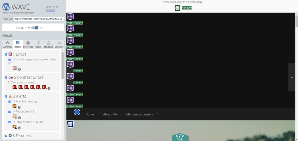
This is my wave report screenshot.
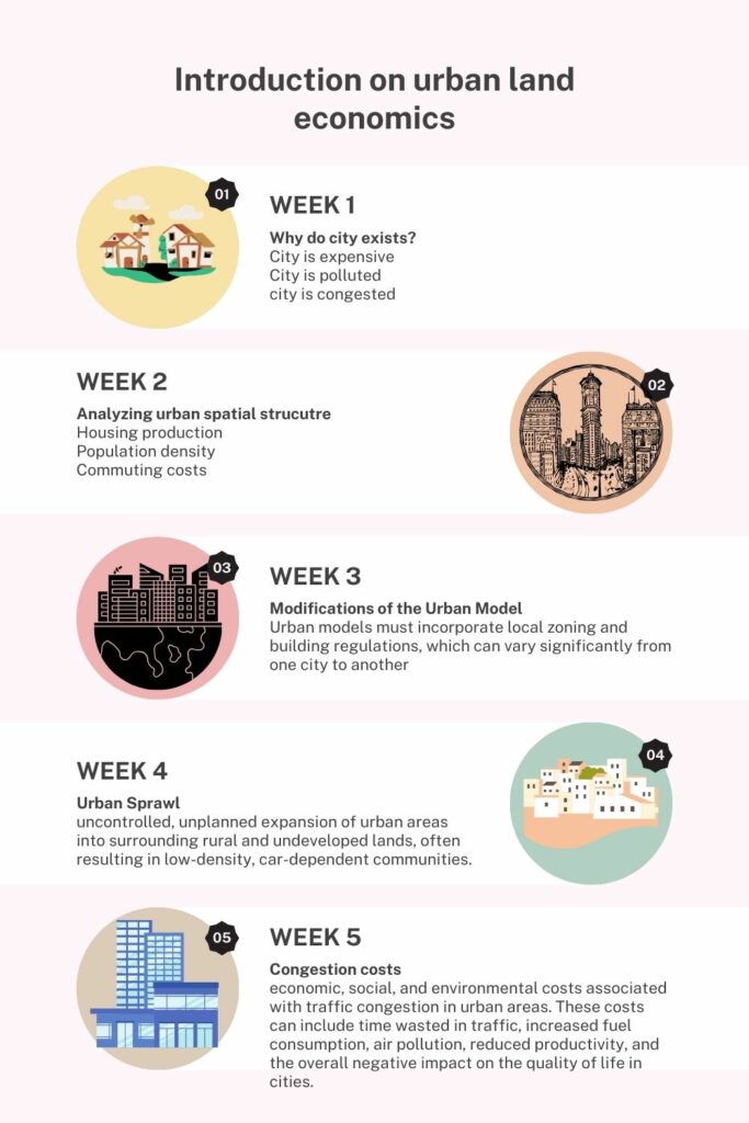
This is the my infographic.
I did the WAVE accessibility analysis on my blog post and discovered some problems I hadn’t expected. On a few photographs, the alt text was missing or had some contrast issues. I wasn’t expecting to discover these problems as I believed I had adhered to accessibility best practices. In my upcoming blogs, I’ll pay closer attention to the contrast and include comprehensive alt text.
Text-to-Speech Tools: I’ve used text-to-speech tools previously, and I really like it. They not only aid in making content accessible to those who are blind or visually impaired, but they also provide an alternative method of content consumption, which can be advantageous for different learning styles. The learning process can be impacted by experimenting with various voices.
Canva’s infographic design principles: I focused on alignment, hierarchy, contrast, repetition, and balance when designing my infographic. I made sure there was white space and stuck to a small color scheme. These techniques contributed to the infographic’s clarity and interest. By giving designers a place to start, Canva’s templates facilitated the design process. However, it is crucial to modify the templates to match the content and retain simplicity.
Accessibility for Learners with Visual Impairments in Infographics: I would make sure that infographics provide detailed alt text for each image and a description of the main visual components in order to make sure that readers with visual impairments can access the same information. For physical access, I would also think about employing tactile graphics or embossed versions. It can be useful to provide audio descriptions for the infographic’s visual components.
Creating settings, products, and content that are accessible to and useable by everyone, regardless of their skills or limitations, is what I mean by inclusive design. It involves accepting diversity and making an effort to get rid of prejudices and impediments. It’s a strategy that benefits the general public as well as people with disabilities.
Presentations in The World’s Worst PowerPoint Presentations: These presentations frequently use multimedia and design principles improperly. They employ excessive amounts of text, lack a clear hierarchy, and stuff material into too many slides. They frequently overlook UDL requirements, inclusive design principles, and Mayer’s ideas. These ideas can be used to improve the effectiveness and accessibility of presentations.
samw
2023-10-14 — 4:02 pm
Hello Yicheng. Thank you for sharing your second blog. In the first wave detection report, we encountered similar issues, such as the image aspect ratio problem, which I believe is easily fixable. After reading your blog, I found your Canva section particularly well-done for urban land economics. You’ve listed a lot of issues within urban land economics, and I also think Canva is a very useful tool for creating infographics.
jinyiguoedci337
2023-10-14 — 7:43 pm
Hello Yicheng:
Thanks for sharing, we had the same feeling honestly, when I saw the WAVE accessibility results at first, I was shocked and I didn’t expect so many mistakes, we definitely should pay attention to those errors next time we write blogs, also your infographic is really organized and well-designed, you mentioned that you focused on alignment, hierarchy, contrast, repetition to balance your infographic, however I suggest that you could also consider the proximity when organizing your graphic elements because it seems a little bit crowed to me, overall great work, you demonstrated critical thinking in your blog, thanks for sharing ideas with our group members, let’s keep working.
Jinyi Guo